Evanston House Remodel
We are so excited to share our whole home makeover of this Old Tudor house located in Evanston. The goal for this makeover was to keep the original aesthetic and incorporate modern pieces designed to match the look and feel of the existing home.
Kitchen
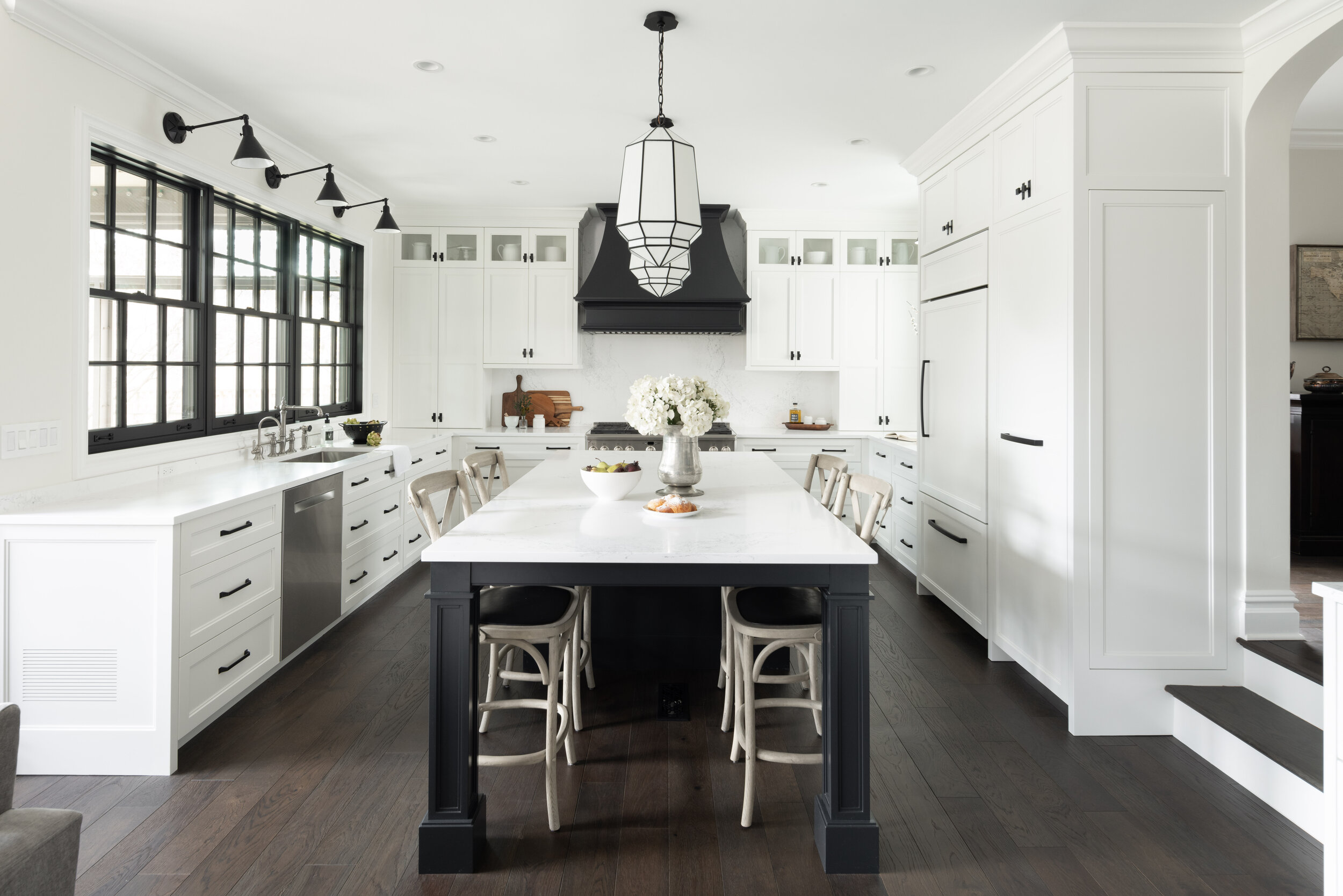
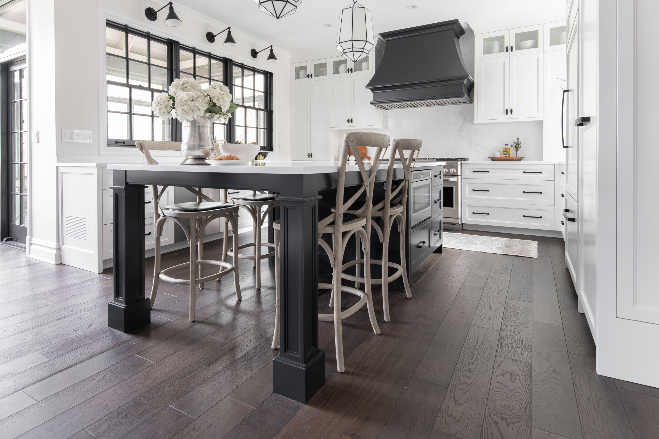
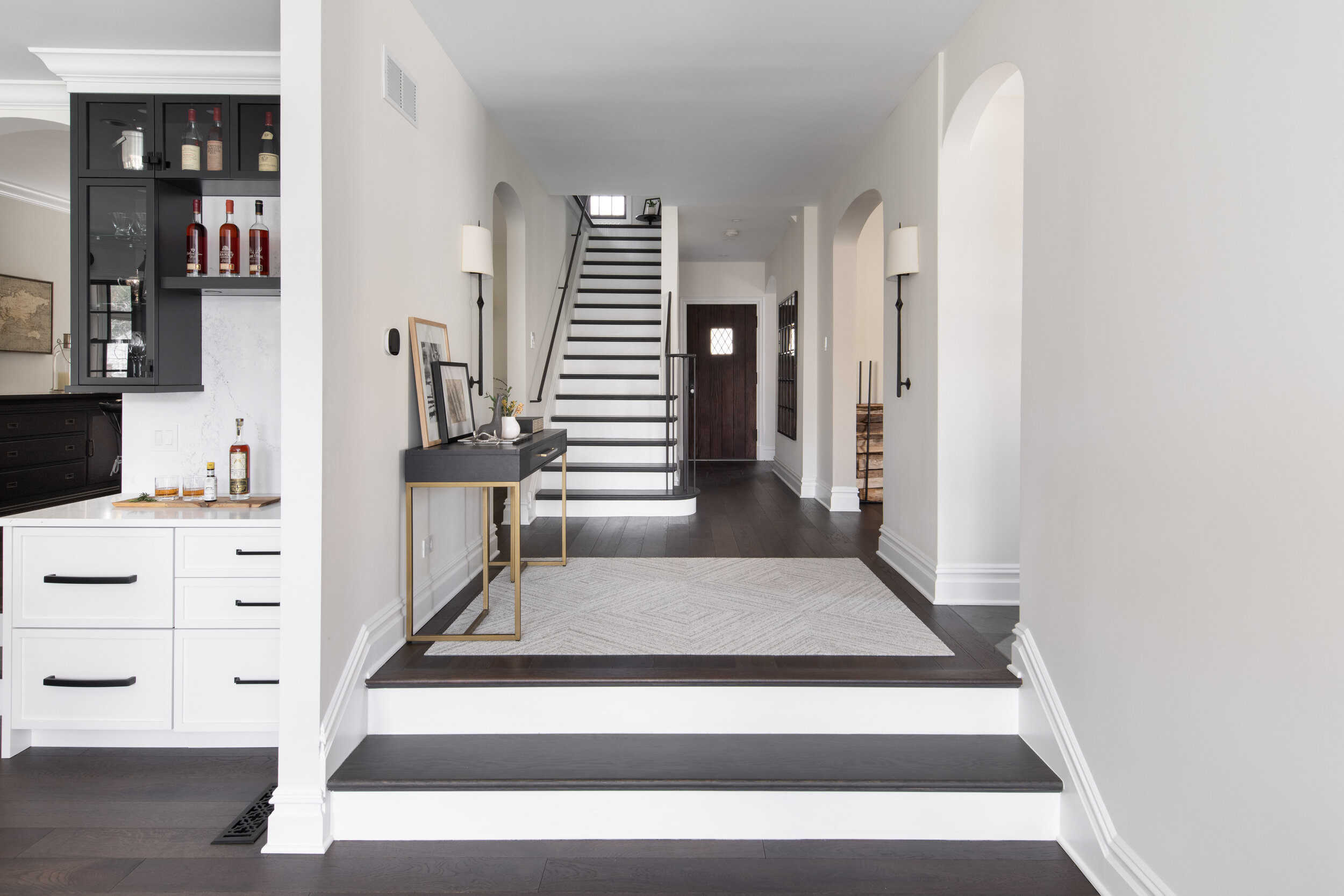
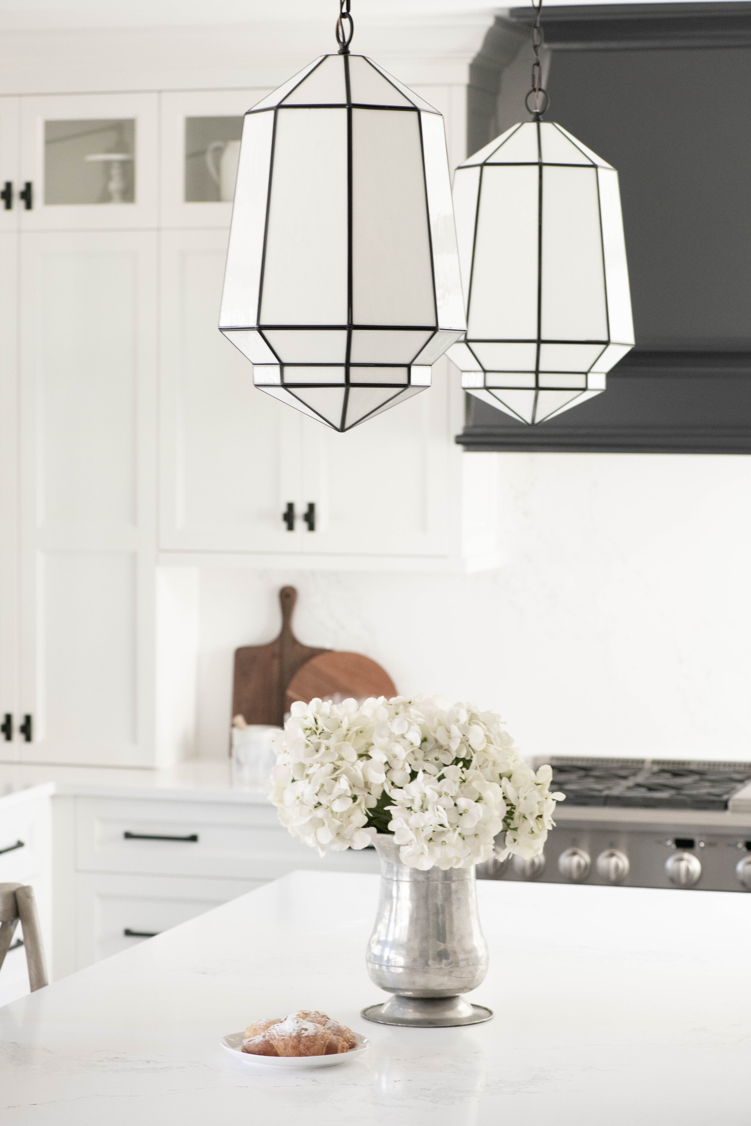
The reconstruction of the kitchen started with dropping the floor down 15 inches to make it level with the rest of the home. The original kitchen was closed off with half height walls and poles throughout - these were all removed to open up the space and structural metal beams were installed to maintain structural integrity. The original opening to the dining room was moved to better fit the layout and was treated with an arch that matched the home’s original design. The location of the old door to the screened in porch was relocated and placed with a new glass slider door. New windows were added over the sink to bring in more light and the other existing window was expanded for the same reason. All of the windows were chosen to match the Tudor style and were painted black. Black sconces and a pair of unique pendant lights were added to bring in even more light.
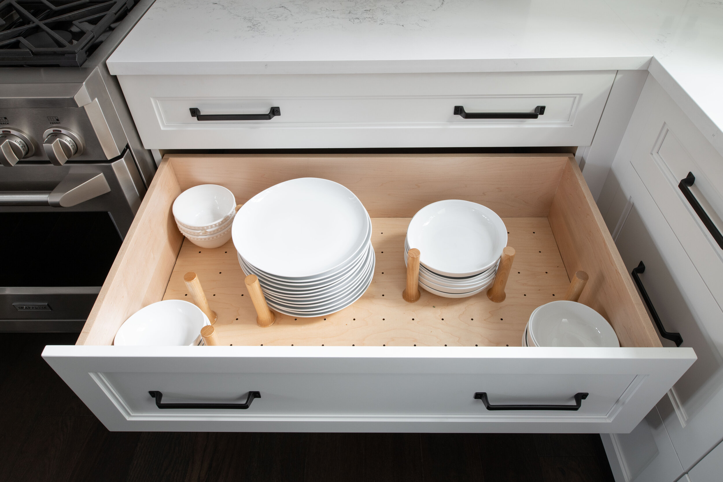
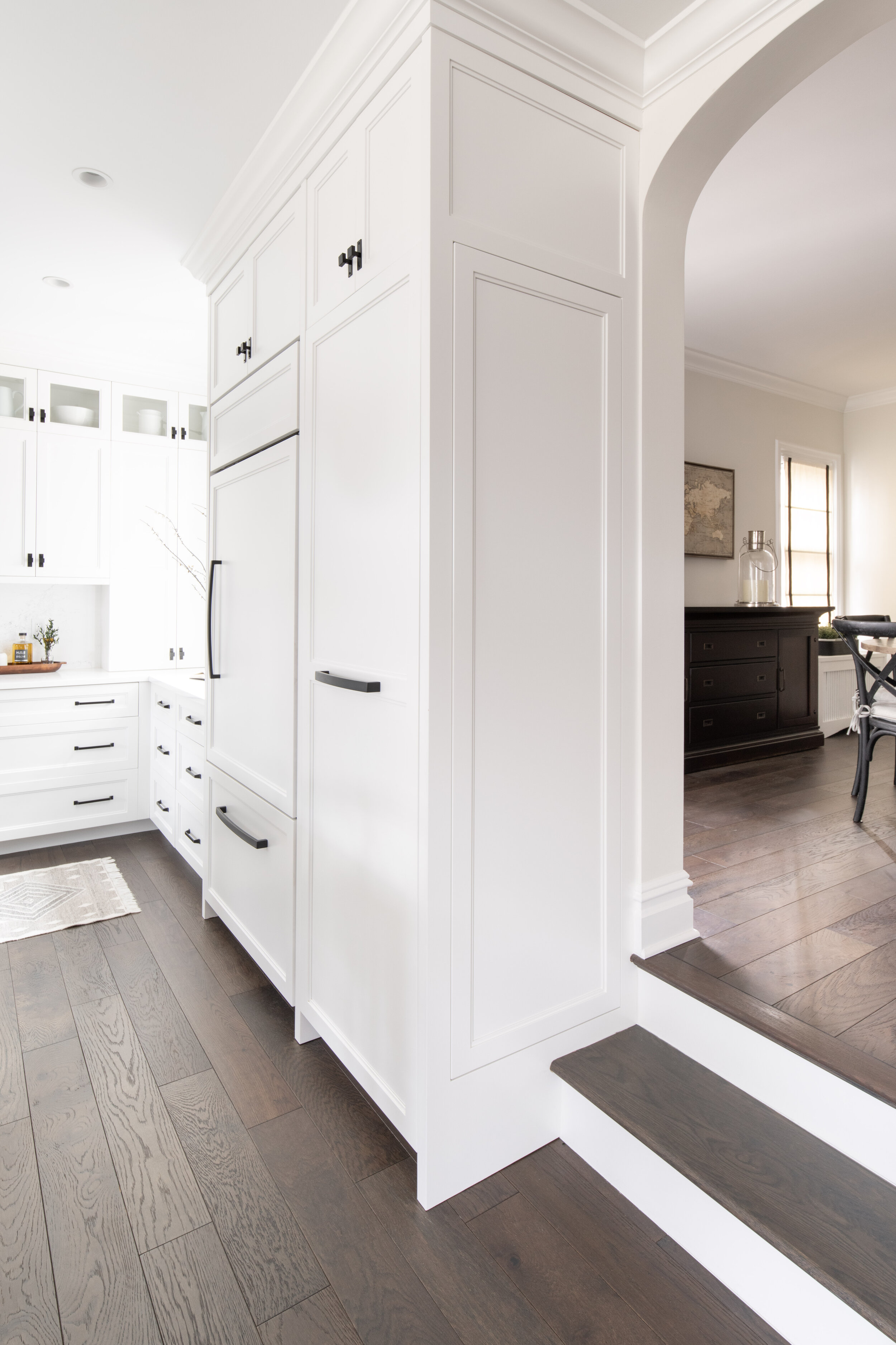
Organization, storage, and ease of use in the kitchen was paramount for the client. We designed custom cabinetry which promoted a highly efficient use of the space. While building out the design of the cabinetry, the heating and cooling ducts were custom routed through the design (keen observers will note the vent that can be seen in the cabinetry). All of the base cabinets are drawers instead of the traditional door opening. This makes it much easier to visualize what is being stored in the cabinets and prevents you from having to crawl into the cabinets to get what you want out! Plates, pots and pans are organized via a peg board system in the pull out drawers. Large kitchen utensils, spices and cooking knives all have custom drawers for easy access and organization. Additionally custom cabinetry was designed and installed for cutting board and small appliance storage. All of the cabinetry has built-in lighting underneath, as well as, puck lighting for the glass cabinets.
A hidden utility cabinet was built for storage of larger items and an outlet was installed to keep the vacuum cleaner charged. The pull out pantry makes it very easy to find what you’re looking for when cooking up dinner.
To maintain a seamless design, the built-in refrigerator and freezer have custom cabinet panels which allows it to blend in the design. Speaking of keeping things cool, the bar has two large drawers that are actually doors to the refrigerator found underneath. The bar also has a drawer with a built-in outlet which acts as a charging station for the clients’ personal electronics.
A custom designed island was built and features a built-in microwave, additional storage space and hidden area for the trash can. All of this is topped with a quartz countertop - quartz from the same slab that was used for the island was also used for the full height backsplash.
The 48 inch dual fuel range with double oven is topped with a custom designed hood.
Dining Room
The two original windows were restored and repurposed as wall decoration in the dining room which really ties in with the original Tudor feel. The new windows were treated with custom Roman shades with black pinstriping. The circular dining room table was chosen to encourage conversation, as well as, act as a place for the family to complete puzzles. The criss cross pattern of the chairs harkens back to the design of the original lead windows displayed on the wall.
The wall sconces and black chandelier were chosen and installed, as they were a perfect fit for the period. A custom radiator cover installed to allow it to blend into the background of the room.
Living Room
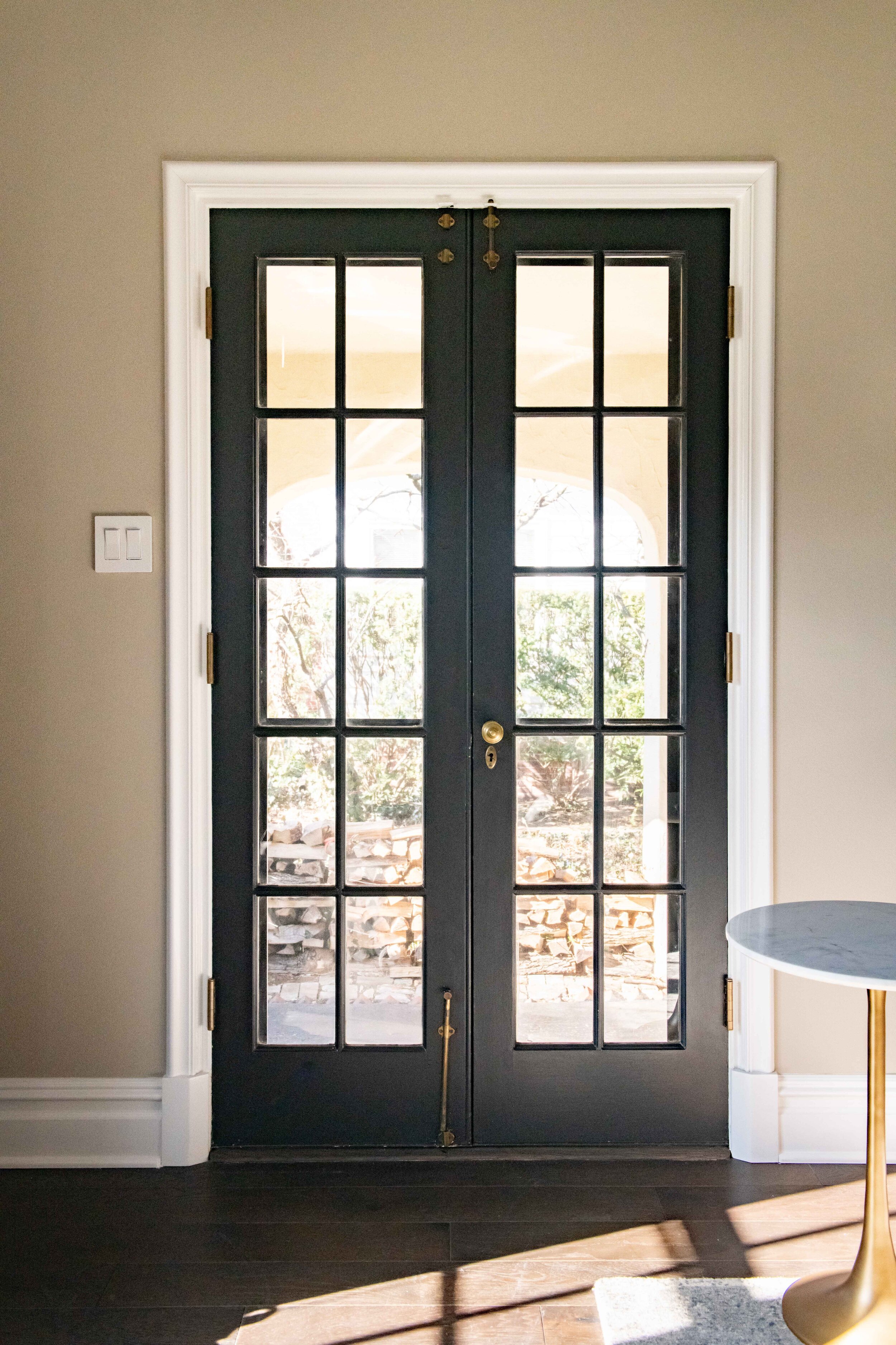
The original door to the living room was restored. The original hardware was able to be used and served as an inspiration for built-ins in the family room. The ceiling beams were original to home and were stained to match the floor. A period chandelier was chosen and added to the space as well. The artwork on the walls are actually old pieces of music that the client used to play with her grandmother!
Family Room
The clients wanted their family room to be a cozy place to be able to unwind from the day and relax. Ample amounts of comfy seating was added.
A gas direct vent fireplace was added and a custom designed and built mantle was installed. The television is housed in a custom niche above the fireplace. To the left of the fireplace is a custom designed built-in cabinet and glass display case. The cabinet is accessible through pocket doors and acts as media storage. The air ducts for heating and cooling are vented through a custom toe kick located at the bottom of the cabinet. The glass display case features hardware that was found to match the original door.
A new sliding door that opens into the screened-in porch was added and all of the original windows were kept but repainted black to match the new direction of the home.
A custom non-structural beam was added on the ceiling and was stained to match the color of the floor. This acts as an elegant call back to the original beams found in the living room.
Office
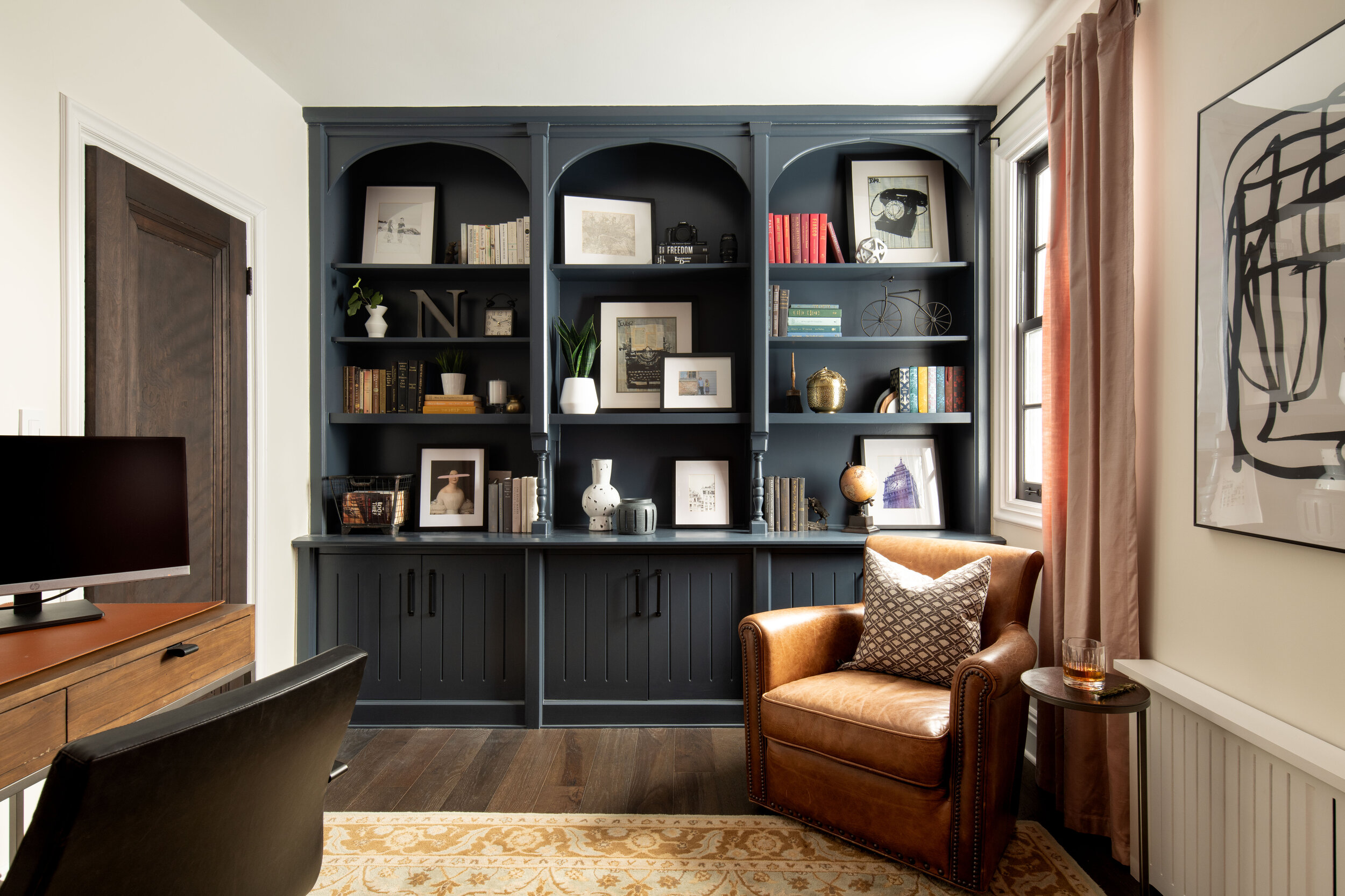
Most of the office was kept original but restored to its former glory. The original built in was painted and new hardware was installed. The original door was stripped and restained to match the floor.
Powder Room
Remodeling of the powder room started with removing the original closet and walls and relocating the toilet (and plumbing). A new console table sink was installed that matched the period of the home. The existing window was restored and wooden wainscott was added to the walls, along with crown molding. An arched iron mirror was found to match the design of the window. The bases of the sconces reflect the pattern of the windows.
The original radiator was removed and replaced with a wall base radiator to save space.
Foyer
The original foyer had an arched drop ceiling that was removed so that the ceiling could be raised. In order to preserve the original aesthetic of the home, the original door was stripped and stained. All of the flooring was removed and replaced with new hardwood flooring and baseboards. The railings and balusters of the main staircase were removed and replaced with custom curved metal posts and balusters.
The space was finished with new lighting, tall iron wall sconces, and an arch mirror in the doorway to give a more open feeling.
Front Door Nook
The front door nook was originally used as a phone nook. Since this was an outdated use for this space, the old bench was removed and replaced with a stool and mirror. The original ceiling was raised 12 inches to give a more airy feeling.
Mud Room
The rear entry of the home enters in through the mud room. This is the primary entrance for the family. Storage was built for coats, shoes, backpacks and acts as an overfill for larger items. A petite shelf was installed to house keys and wallets. The floor was redone with a porcelain chevron tile.


