Wicker Park Kitchen Rehab
The clients for this project were two professionals that hired Metro Design Build to complete the full design build process for their total kitchen rehab project.
They requested that the design utilize the space more efficiently and create a better layout that allowed space for an island. Additionally, the previous design felt very crammed and dark, so they wanted the new design to feel more open and bright.
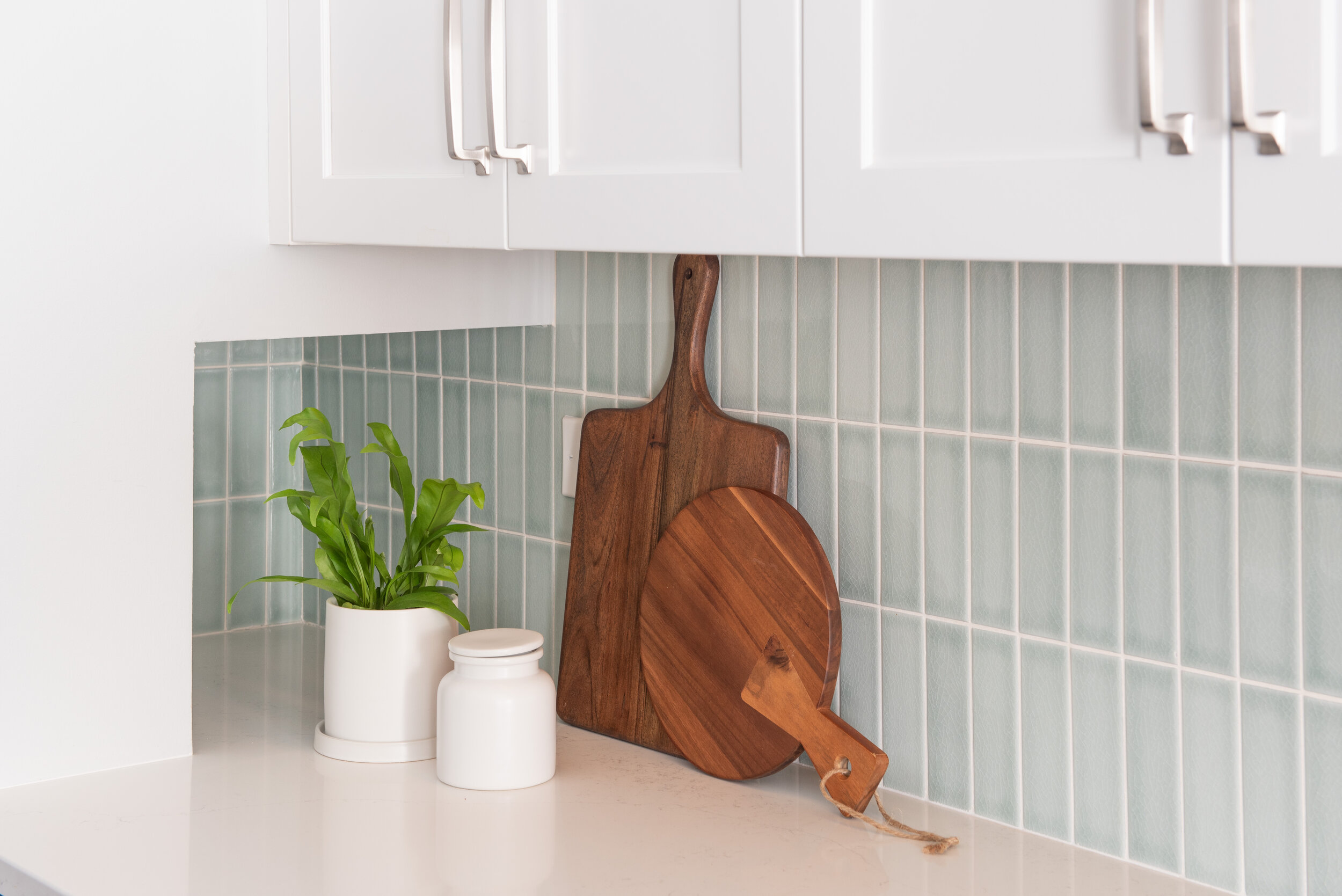
The color palette for this kitchen was inspired by a piece of art that clients loved. As you can see in the photos, the color scheme revolved around the use of nautical blue, light blue, and white - it is reflective of the colors used in the inspirational art piece. The white and lighter shade of wood served as tools to brighten the space while the nautical blue added drama to palette.
The entire layout of the kitchen was redesigned to maximize the space and functionality of the kitchen. This included changing the locations and hookups of the refrigerator and range. The small inefficient cabinets were removed, along with the awkwardly shaped island. Custom cabinets replaced the old cabinets that were removed and a new more functional custom island was built and installed.
The island is the epitome of stylish functionality. It was built to seat four, has a built-in bookend shelving area for cookbooks, has the microwave incorporated in the design to optimize counter and cabinet space, a pull-out drawer for garbage, a specialized stow away step stool in the toe kick, and cookie sheet storage under the microwave. All of this is topped off with a table top made of the same white quartz as the rest of the countertops.
The stovetop range is flanked by two nautical blue column pantries that serve as a frame for the cooking area. The range hood is concealed in the cabinetry to allow the backsplash to be the focal point. The backsplash is handmade tile from California. To the right of the of the rightmost column, if you look closely, you can see the custom niche that houses (and conceals) small kitchen appliances. Speaking of appliances, check out the French door built in fridge and flush installed dishwasher. The single basin undermount sink was chosen for how well it blends in with the white quartz countertops. A Newport Brass faucet with matching soap dispenser were built into the countertops to keep with the sleek look.
A brightened space was made even brighter by adding pendant lighting from Hinkley over the island and a coordinating wall sconce over the sink. Additional lighting is provided through recessed canned lights and under cabinet lighting.
With such a bright and inviting space, of course the clients will be spending a lot of time in the kitchen preparing their favorite meals. To provide some extra entertainment during marathon cooking sessions a custom media cabinet was added. The cabinet provides plenty of storage for media components, as well as, pet supplies for their two dogs.
If you loved this project as much as we did, be sure to follow along for updates on this home because we will be starting their basement project soon and we’re very excited to show that to you as well!


